
Minimum Viable Character
How To Design Scalable Brand Identities.

There’s a kind of recognition that doesn’t rely on names or titles. The moment you spot someone you know from behind—a familiar shoulder, a signature stride. Or see a piece of art and immediately recognise the artist, simply by style.
It’s not about what’s loud or labeled. It’s something quieter, subtler. A set of choices repeated so consistently that they begin to form a kind of fingerprint.
I’ve been thinking about this idea lately—what I call minimum viable character.
It’s the smallest possible unit of identity that still carries full recognition. A single color. Signature style. Shape of a bottle. What remains when all the branding, performance, and polish are stripped away.
The quiet power of one defining detail.
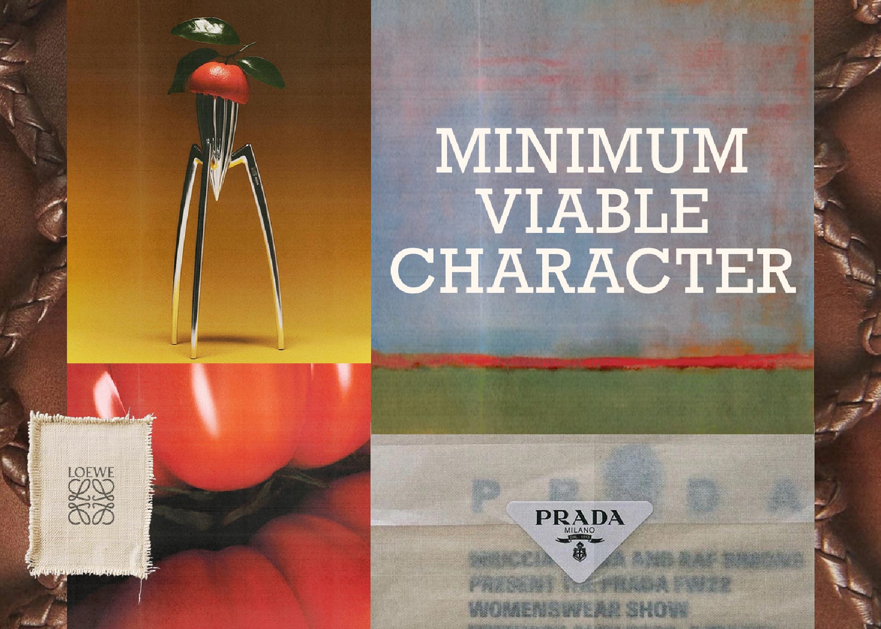
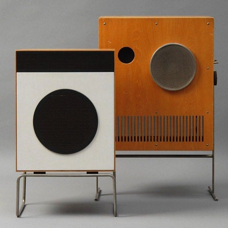
In design, we see it in how certain brands remain legible even in silence. You can spot a Bottega Veneta bag from across the street, not because of a logo, but because of the tension in its weave, the weight in its silhouette. National Geographic doesn’t need to spell out its name; that yellow rectangle is enough. Prada’s triangle, Dieter Rams’ knobs, Rothko’s paintings—they all carry a distilled aesthetic language that is instantly recognisable.
In a world where attention is the most expensive currency, this design principle might be your most valuable brand asset. It’s the one thing even your peripheral vision recognizes.
Deceptively simple. But maddeningly difficult to achieve.
The impulse—especially at the beginning—is to show range. To explore, expand, layer. But the most enduring work doesn’t come from more. It comes from less. From restraint—not just in aesthetics, but in concept. The kind of restraint that allows you to ask: What is the one thing about you that someone could recognise in two seconds flat?
That answer is everything. Because when you find that single, distilled element be it a shape, a color, a texture, or a tone, illustration style you remove the need for your audience to decipher layers. You give them something to hold onto. And the smaller the unit of identity, the more powerful it becomes. It's easier to scale. Easier to spot. Easier to remember.
On a shelf. In someone’s peripheral vision. Across a feed or a city.
That’s why it matters that it’s one. Because when everything else gets noisy or stripped away, that one signal still carries meaning. And once you find it, you don’t need to over-brand or over-explain. You just repeat it deliberately, consistently until it becomes unmistakably yours.
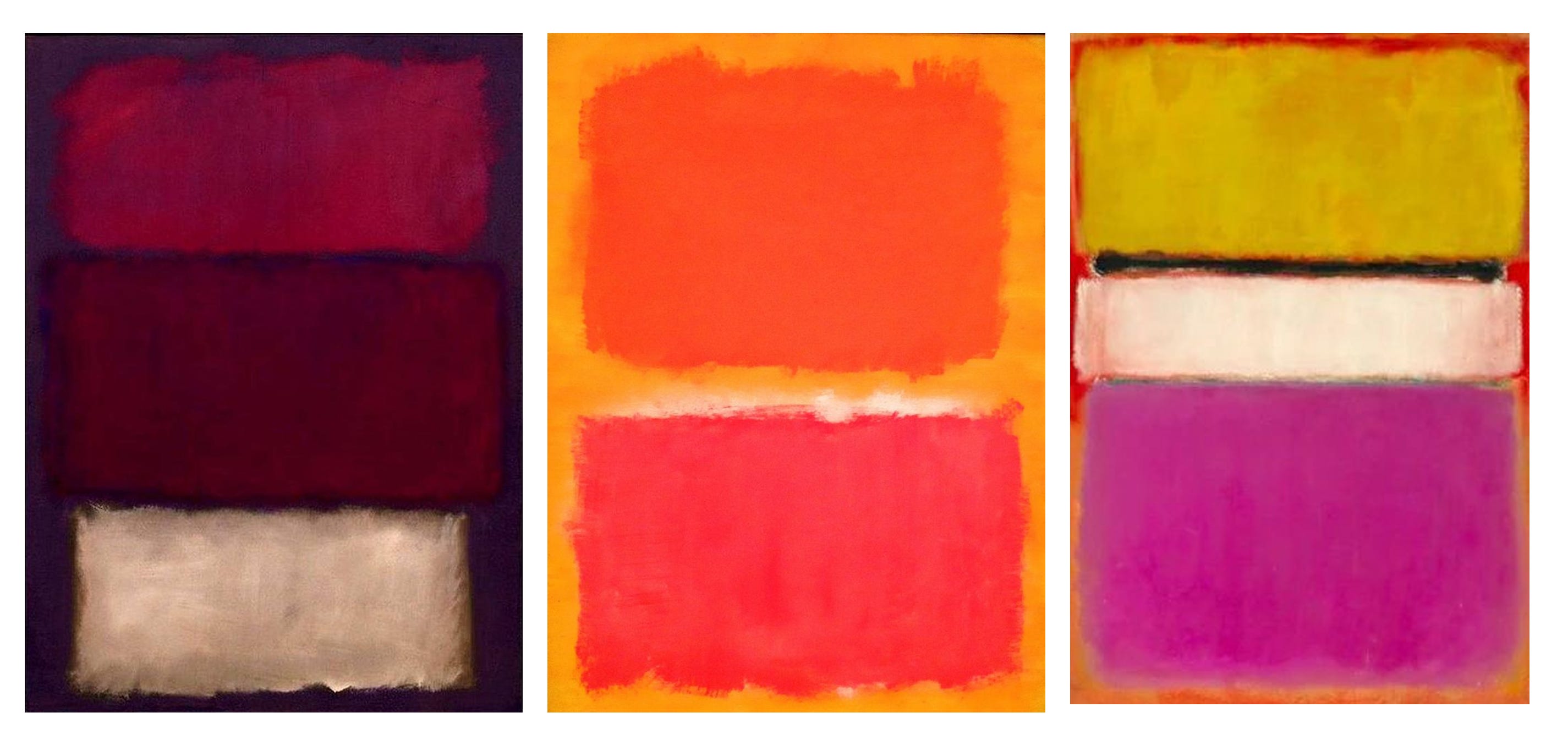
You can see this idea—minimum viable character—in the work of Mark Rothko. Stripped of subject, narrative, or fine detail, his paintings are instantly recognizable. Just two or three fields of color, suspended in tension, and yet you know it’s a Rothko. The scale and the softness of the edges. No signature needed. Just atmosphere, repetition, and restraint, proof that identity, when reduced to its essence, can speak louder than complexity ever could.
Minimum viable character isn’t just a brand strategy. It’s the deepest form of design. Because it asks you to stop performing and start refining.
So whether you're shaping a brand, a body of work, or a way of living start here: Find that one thing. A color. A shape. A vibe. A presence. The quiet thing that only you carry. And make everything else orbit around it.